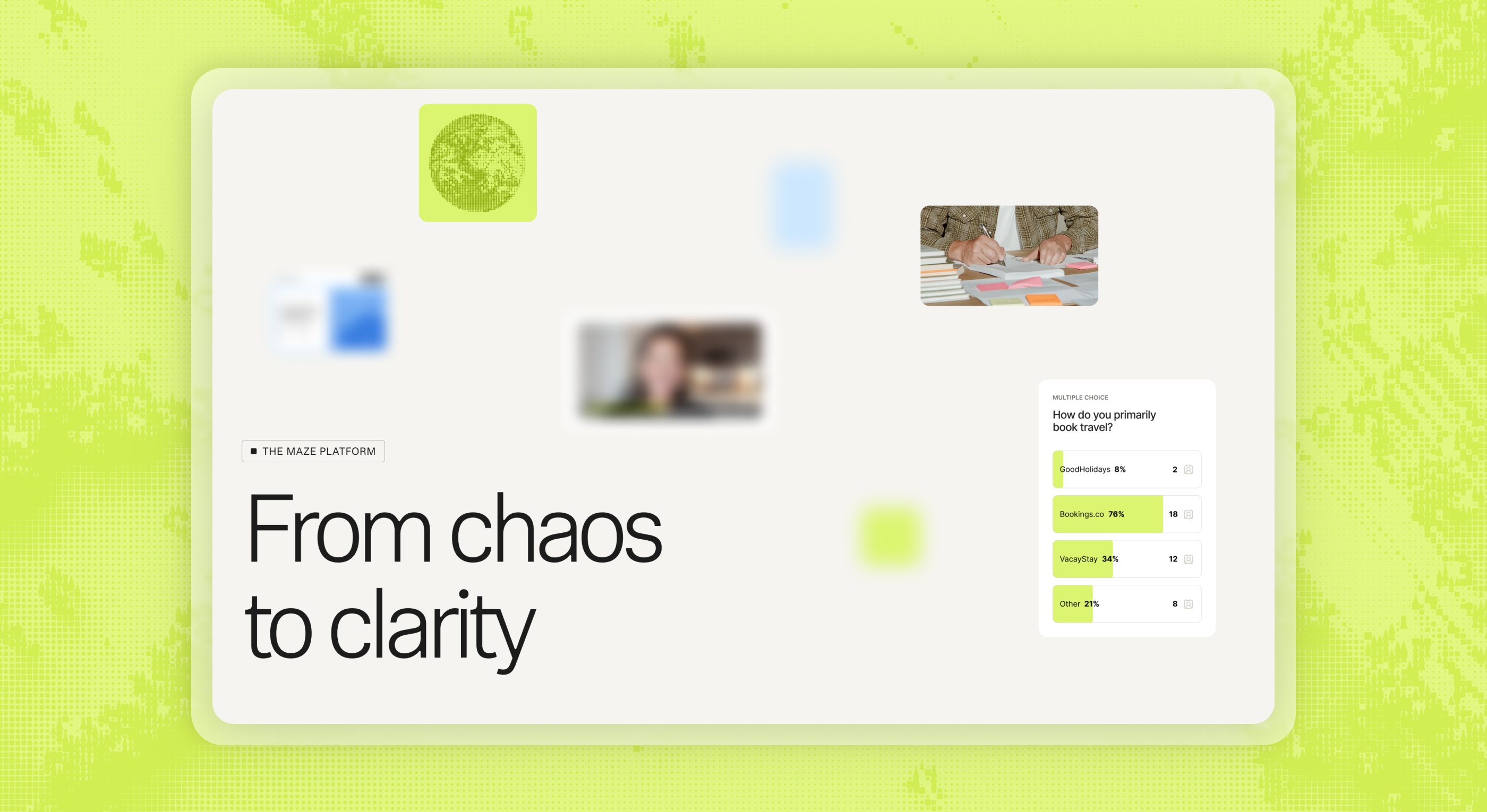
With a new brand guide nearing the finish line, Maze needed their website to speak to their new brand. My task was to translate this new voice into a website, complete with custom interactions for high-traffic pages as well as CMS-focused web components for all existing and future product feature pages.
With more than 20 pages to redesign, principal designer Natalie Harris and I divided and conquered. We each took on half of the work, which primarily consisted of three buckets: custom pages, CMS pages, and the component library. The process was not linear, and the design decisions made for each bucket informed the others.
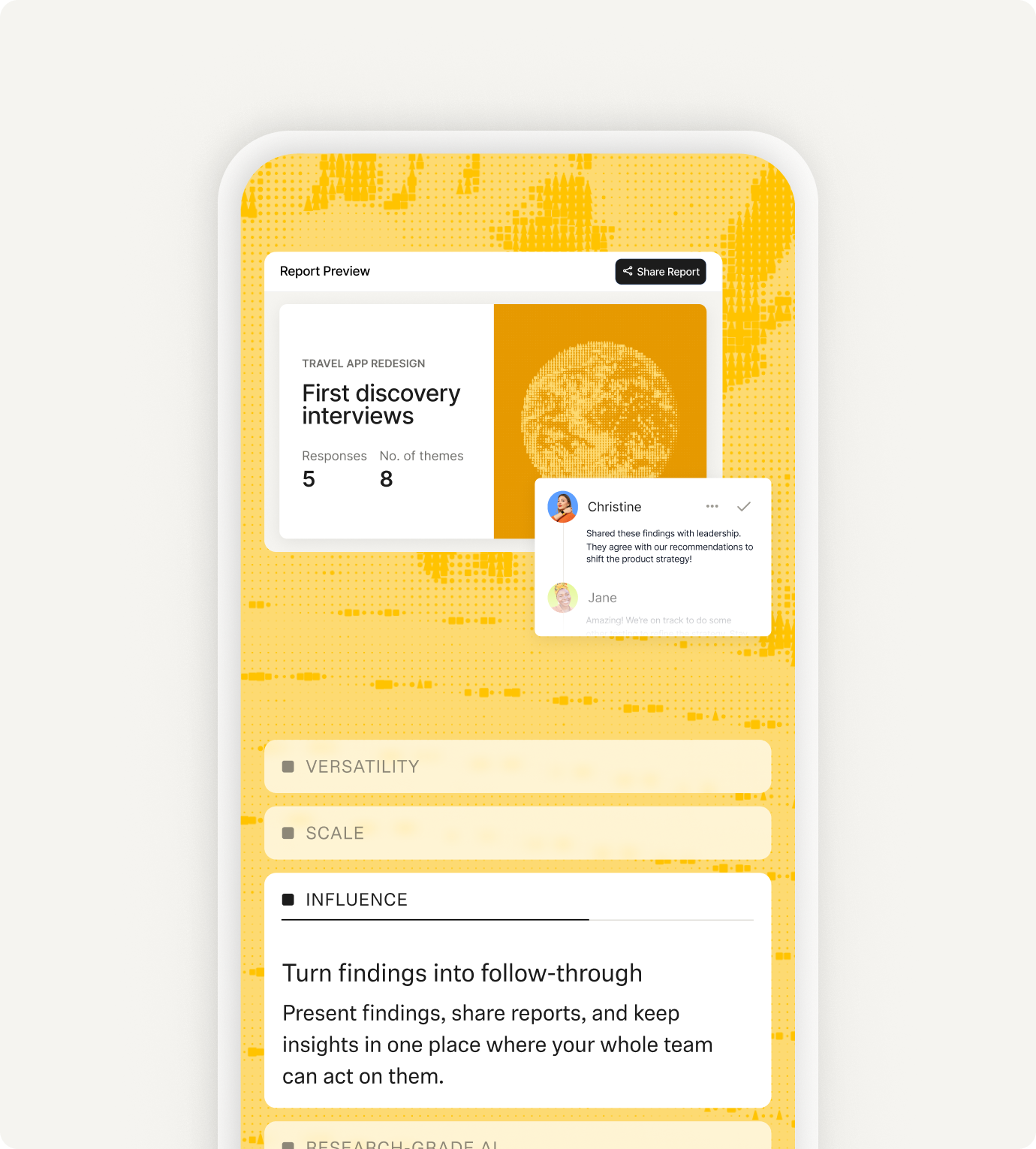
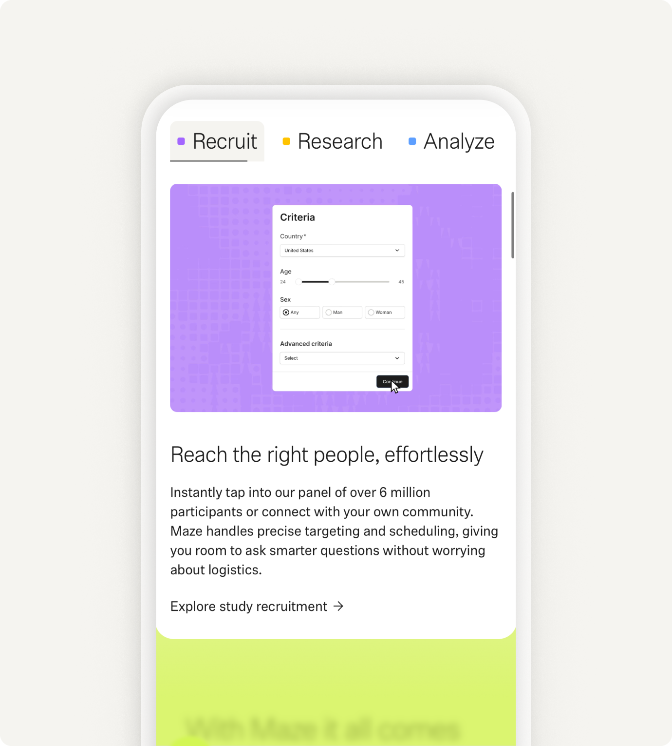
One major challenge was the gap in product versus marketing. The call was made to recreate all product UI illustrations in the new brand style, yet the product itself was not scoped to be redesigned during this project. A big portion of our time went into dissecting product screens and making up what they could potentially look like in future.
There were also many opportunities to explore new interactive patterns and establish guidance around what type of content lived in what type of component. For example, we targeted the classically overused left-right text and image layout and created different component options depending on how much or little prominence the feature ought to have on the page.
The brand itself was a joy to stretch. The Maze team built an internal tool to create customized image treatments that resulted in something between pixellation and mosaic tiling. This created opportunities to add texture at different scales to otherwise generic product UI illustrations. The wide range of colors was also delightful to experiment with, diverging from traditional brand palettes that center around a single primary color. If you got the mix just right, the ever-changing palette was the brand color.